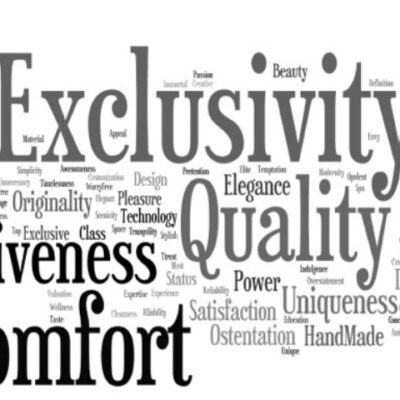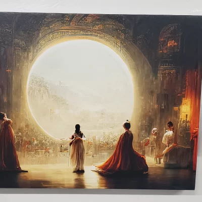
Colour has always been a storytelling device to denote strength, status, exclusivity and rarity. Luxury brands have used colour’s power to communicate and evoke profound emotional responses.
We explore this topic more in 'True Colours': the ninth of our series of ‘Brand Matters’ articles for Luxury Briefing: the renowned international magazine for the luxury industry.
You can read the full text below.
Chanel black & white; Tiffany turquoise; Burberry beige; Dior pink & grey; Veuve Clicquot yellow; Cartier and Louboutin red; Hermès orange; Lacoste and Harrods green; Boodles pink & black, Apple white - these are the colours of brand exceptionalism.
The great luxury business founders (and indeed religious leaders, retailers, rulers and Royals) were handy with a palette. That's because colour has always been a consequential communication tool used as a storytelling device to denote strength, status, exclusivity and rarity.
The depth of meaning in colour has intrigued image makers. A popular book in Mad Men days was The Lüscher Colour Test. Invented by psychologist Max Lüscher, it was for psychiatrists, psychologists, and those who work with the conscious and unconscious characteristics and motivations of others. Its principle is that accurate psychological information can be gained about someone through their choices and rejections of colours. One for planners everywhere.
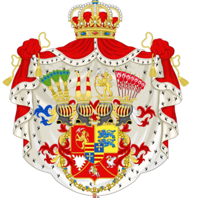
But really, it is history that has taught us some timeless truths: black symbolises power, elegance, mystery. Purple means royalty and speaks of extravagance and exclusivity. (In ancient times the dye used to produce the emperor’s purple clothes came from snails, was extremely expensive to produce, and therefore rarely seen on anyone other than royalty.) Royal blue channels regal insignia, instilling confidence, trust and authority. Red was the colour of nobility during the Renaissance. Minimalism, greige and neutrals do understated refinement, sophisticated, quiet luxe lifestyles with a clean canvas for craftsmanship and detail. And gold obviously says wealth.
The smart brands above have nailed their colours to their masts for decades, making them iconic, by consistently featuring them on all their products, but most of all in their comms. Like yellow? Go to a Veuve Clicquot experiential event. It is a serious business.
Take pink. Not any old pink. Art deco high-rise, soft, electric Miami sunsets pink. Pantone 1895C to be precise. That will be soccer star Lionel Messi’s Pink Jersey for Inter Miami. The NYT says it is “the hottest piece of sports merchandise on the planet.” It’s so coveted that even Beckham has found it hard to get hold of one.
Having worked with CORDURA fabrics, I appreciate how closely the development of colour is linked to the world’s advances in areas such as biology, chemistry, mathematics, textiles, anthropology, fine arts, and colour theory in optics and art. Many stories to tell as a result.
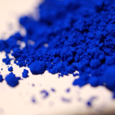
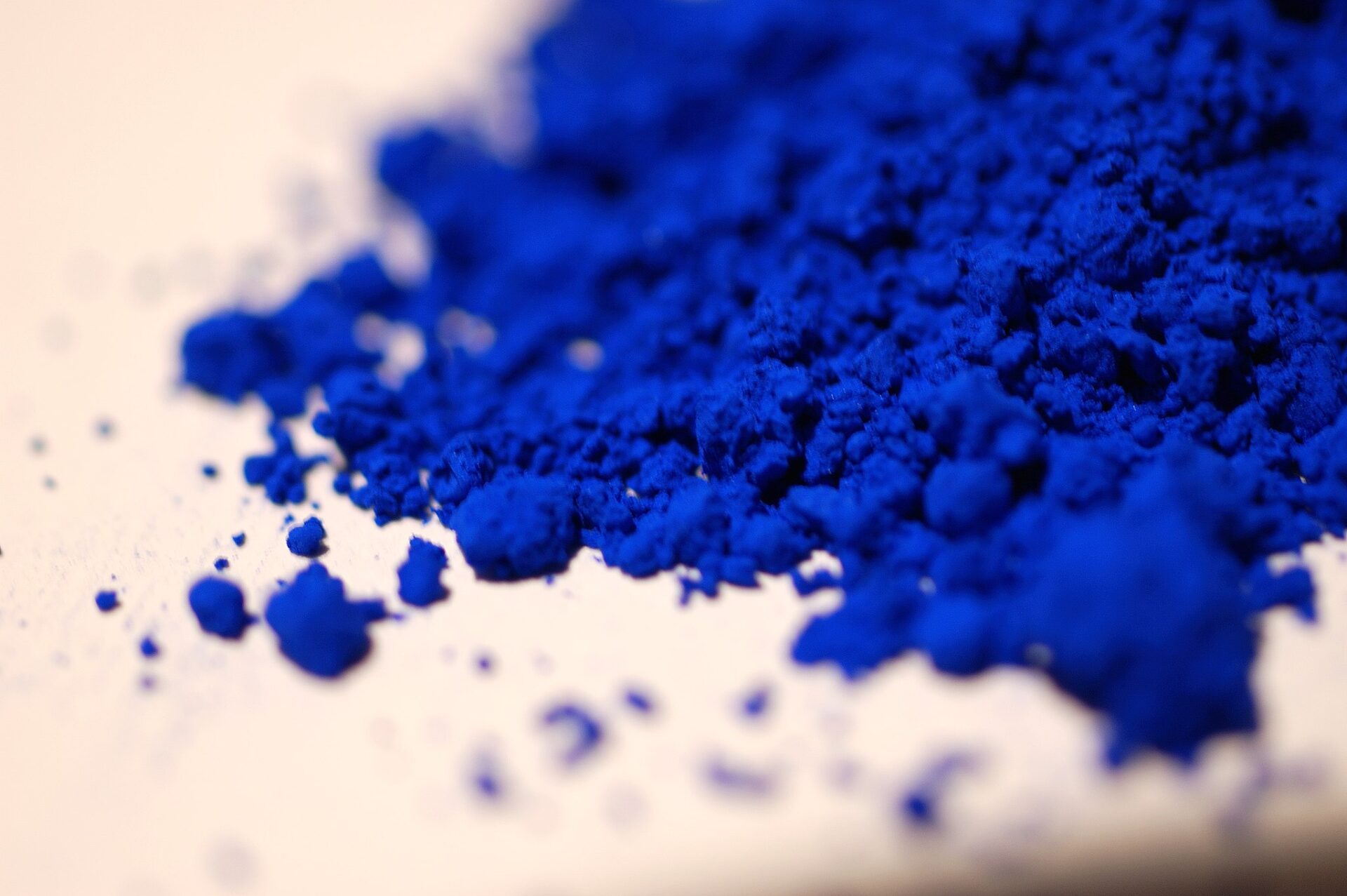
Famously, blue’s a big winner in the meaningful narrative stakes. The only colour to have an entire state of being and art genre named after it. The blues. Allegedly derived from a 19th century phrase ‘blue devils’ which described the hallucinations one gets doing cold turkey from alcohol. It is the best shorthand there is for melancholy and depression. ‘Trouble in mind, I’m blue, I have almost lost my mind, never had so much, trouble in my life before.’ As Muddy Waters put it.
Away from the blues, chocolate brown is having a luxury moment. Vogue says it has an understated elegance to it that can offer more depth than black. It brings warmth, earthiness, and a timeless calm that feels grounding and comforting. Indeed.
For Christian Dior, pink was the colour of the heart and Dior’s personal happy memories of the blush-pink shade of his childhood home in Granville. Grey the colour of elegance and refinement.
For Tiffany & Co, its robin’s egg blue colour ‘which is more than a brand icon but a sacred cow’ made customers irate when new owners LVMH introduced Tiffany Yellow. It was for a pop-up at its Beverly Hills store. A colour-expert saw deep meaning in the choice of the bright, bold canary yellow colour. “If you look at the colour wheel, this yellow is almost exactly opposite blue. It has maximum visibility, whether in print or online, and maximum shock value. If you want to signal you are doing something different, you might as well do the exact opposite.” Forbes reported in 2021.
For Chanel, black was the colour of mourning, work and servants’ clothes before she launched her black sheath dress on the market and turned it into the colour of “smart” elegance, ideal for any occasion. It was also the colour of the nuns’ clothing at the local convent where she was sent as a girl to study with the sisters, who taught her how to sew. For Chanel, black was essential, sharp and the ideal complement for highlighting her other core colour white.
Lastly, green. Pundits say, maybe unsurprisingly, it is the true colour of modern luxury. In 2017, the Pantone Color Institute named Greenery the Colour of the Year. It was chosen because it embodies the concept of 'environment, beginnings, healthy food resolutions, grass and the outdoors'. The colour was immediately adopted on several designer runways, including Prada, Gucci, Kenzo and Balenciaga.
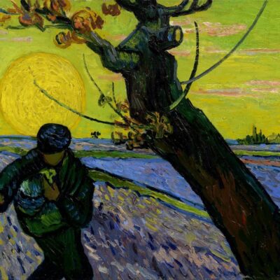
The artist Mark Rothko believed colour to be an instrument that served a higher purpose than mere difference. For him, colour had the power to communicate and evoke profound emotional responses. He felt that it was a short cut into the soul, superseding language and thought to access the core of human emotion.
Can’t get better than that.
In Paris, you can visit the first retrospective in France dedicated to Mark Rothko’s work at the Fondation Louis Vuitton, to understand what he meant.
Read more from our Brand Matters series:
- The enduring importance of craftsmanship here
- Why craftsmanship's vulnerability will win in the tech world here.
- Creativity: From Origins to AI here
- Luxury is ageing gracefully here
- Thinking luxuriously here
- How distance creates desire here
- Why the pursuit of authenticity paramount for luxury brands here
A little more on Anew - a London-based luxury branding Agency
Anew’s two founders deliver: insights from market research, strategic brand thinking, new brand names, luxury logo design, messaging, online and offline content, coffee table books and luxury brand websites. We help companies increase brand profitability through sharper insights, distinctive propositions, creative ideas and faultless execution.
To get in touch do drop us an email. We'd be delighted to meet for a coffee, either face-to-face or virtually to discuss your brief.